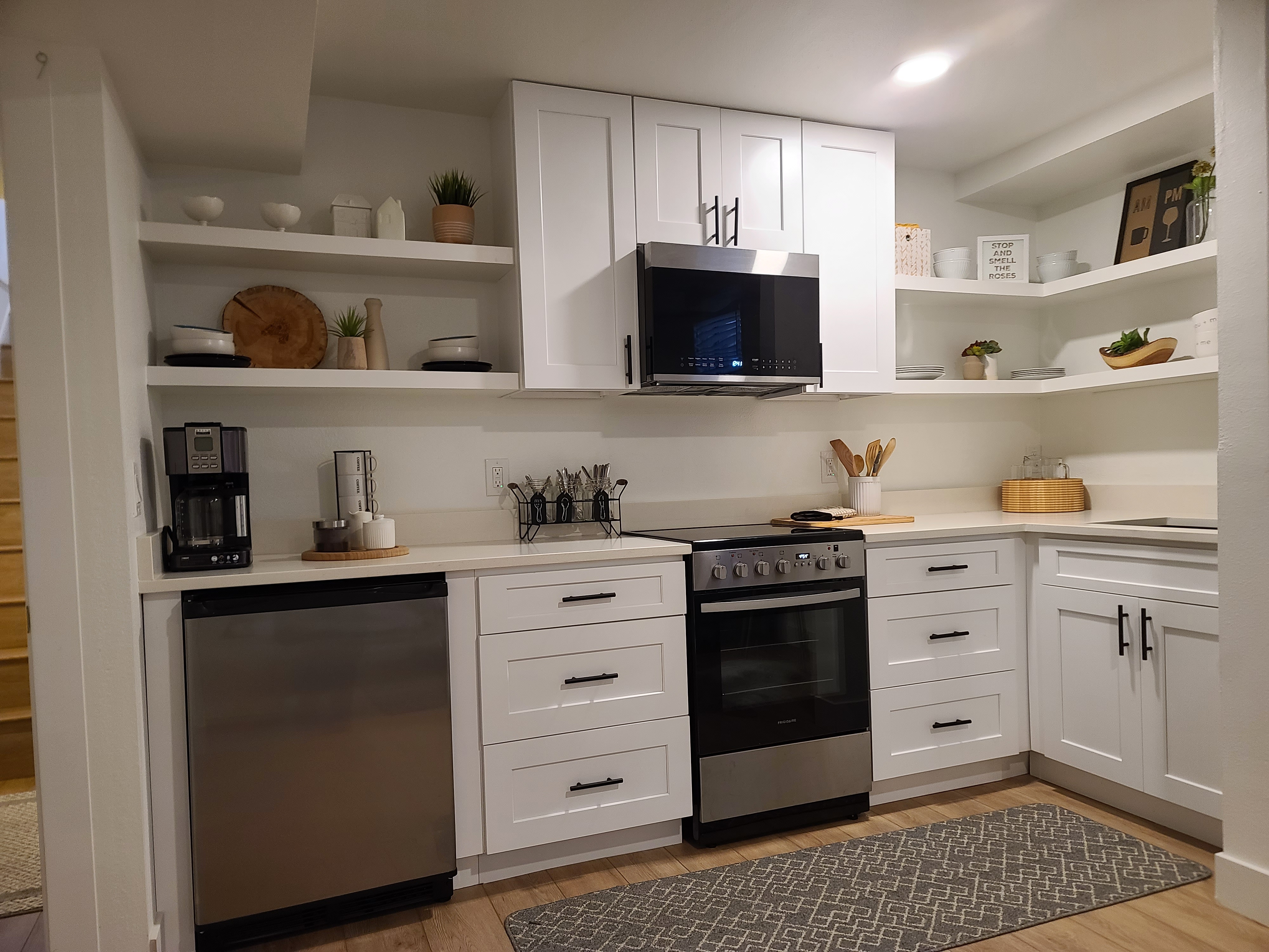
Homeowners love the idea of built-ins, but they often worry about the same thing: "How do we make them look like they were always part of the house?" That's exactly the right concern. A beautiful built-in should feel integrated, not dropped into the room at the last minute.
The difference comes down to architecture, proportion, and restraint. Good built-ins solve a storage or layout problem. Great built-ins do that while reinforcing the existing trim language, room scale, and sightlines.
Match the House Language
Panels, trim edges, paint sheen, and hardware should feel related to the rest of the home.
Honor Existing Lines
Align shelves, uppers, and verticals with windows, door heads, and nearby casing whenever possible.
Build for the Room
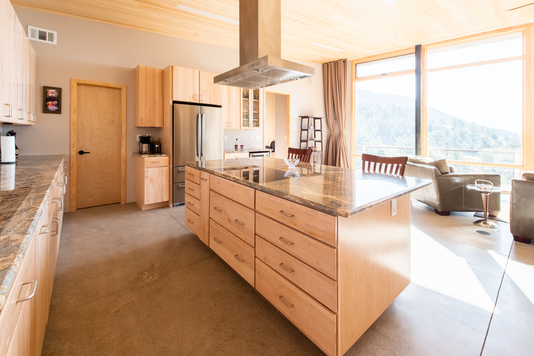
Depth, storage type, and visual weight should fit the room's size and function, not just the wish list.
Built-Ins Should Start With the Architecture
The fastest way to make built-ins look tacked on is to ignore the room around them. If a unit crashes awkwardly into window trim, stops short of obvious alignment points, or uses a panel style that does not exist anywhere else in the home, it will always feel aftermarket.
We usually begin by asking where the surrounding trim wants the eye to go. Is there a strong window line? A casing head height worth echoing? A ceiling detail or base profile that should continue into the unit? Those decisions matter more than how many shelves we can squeeze in.
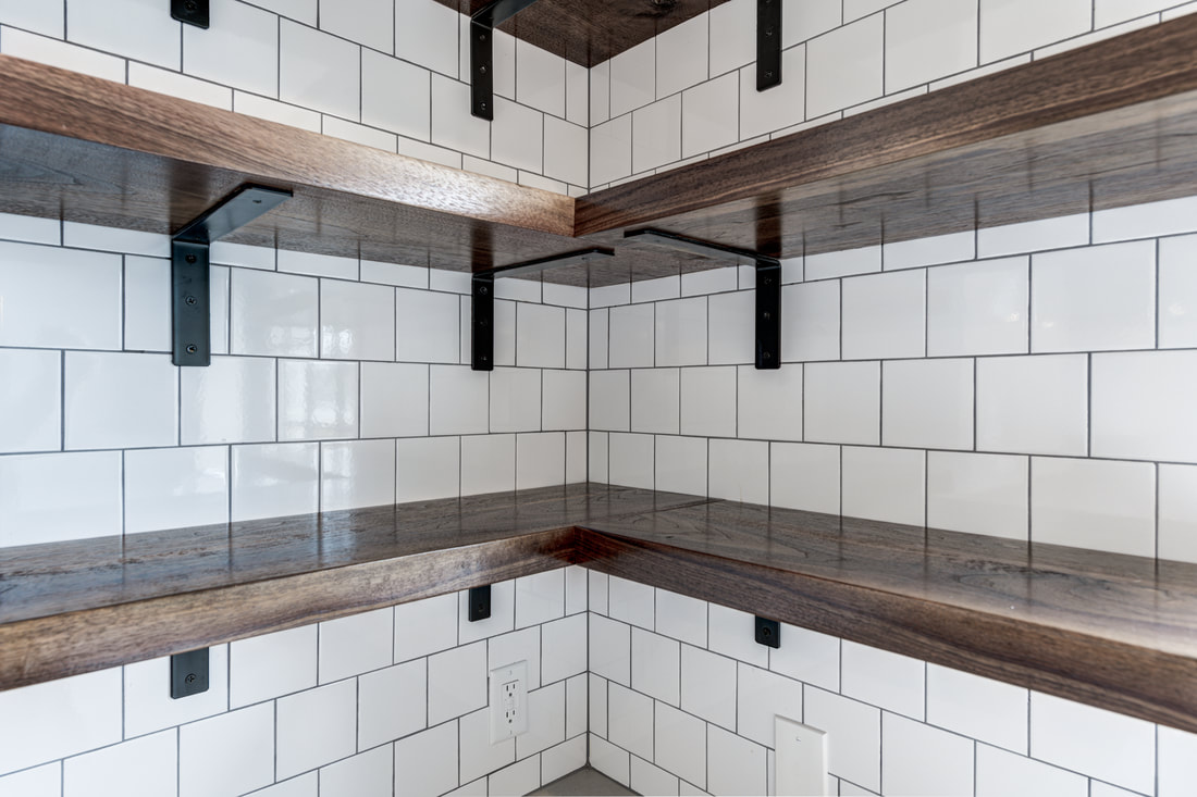
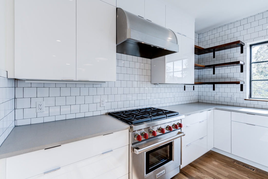
Material and Detail Need to Belong
In some homes, that means painted shaker-style cabinetry with understated hardware. In others, it means warmer wood shelving, darker metal brackets, or a more transitional mix of paint-grade and stain-grade elements. The answer is not always "match everything exactly," but the materials should at least feel like they're from the same family.
"The best built-ins don't announce themselves. They make the room feel calmer, more useful, and more resolved."
Think About Visual Weight, Not Just Storage
Clients naturally want maximum storage, but floor-to-ceiling cabinetry is not automatically the right move. Sometimes a room needs open shelves, a furniture-style base, or breathing room around a window to avoid feeling cramped.
We look at how much mass the wall can carry. A basement bar can take more cabinetry. A living room media wall may need a lighter mix of lowers and open display. An office nook might need only a shallow run with trim details that tie back to the rest of the house.
Function Still Comes First
A unit can be gorgeous and still fail if the shelves are too deep, the drawers open poorly, or the countertop height is wrong for how the space is used. Built-ins become truly custom when they respond to real habits: coffee station, display storage, toys, office gear, overflow pantry items, or a media setup that needs hidden cable paths.
That's why the best projects are designed around the room's actual job, not just a Pinterest image. Once the function is right, the finish carpentry can make it feel seamless.
Our Rule for "Original to the House"
- Reference the room's existing trim, not just the inspiration photo.
- Use alignment points that already exist in the architecture.
- Keep the material palette disciplined.
- Size the unit for the room, not for maximum square footage of storage.
When those basics are right, built-ins stop feeling like add-ons and start feeling like the room was always supposed to work this way.
Thinking about a bar, media wall, office, or storage build-out?
We can help design a built-in that solves the room and fits the architecture. Request a free estimate and we'll talk through what belongs in the space.